Geospatial Trend Analysis of Power Plants Completed in the Last 15 Years
For over 40 years MAPSearch has been actively engaged in compiling unique, proprietary, and strategic energy infrastructure information into GIS databases for use by public and private sectors.
What Does the Data Reveal About a Transition from Fossil Fuels to Renewables?
Electricity supply, and the fuel-source driving the generation, have clearly become a hot button issue relative to reliability-affordability vs. environmental impact. MAPSearch takes a data driven view of Electric Power Generation added in the last 15 years to uncover trends based on primary fuel driving the power generation. We also correlate to individual plant-level installed name plate generation capacity, to assess effectiveness based on new megawatts produced.
Using the MAPSearch Electric Power GIS Database, power plants completed since 2008 with Primary Fuel equal to: Solar, Wind, Nat Gas, and Coal are selected and examined. Primary Fuel refers to the predominant fuel used to continuously power the generator for electricity production.
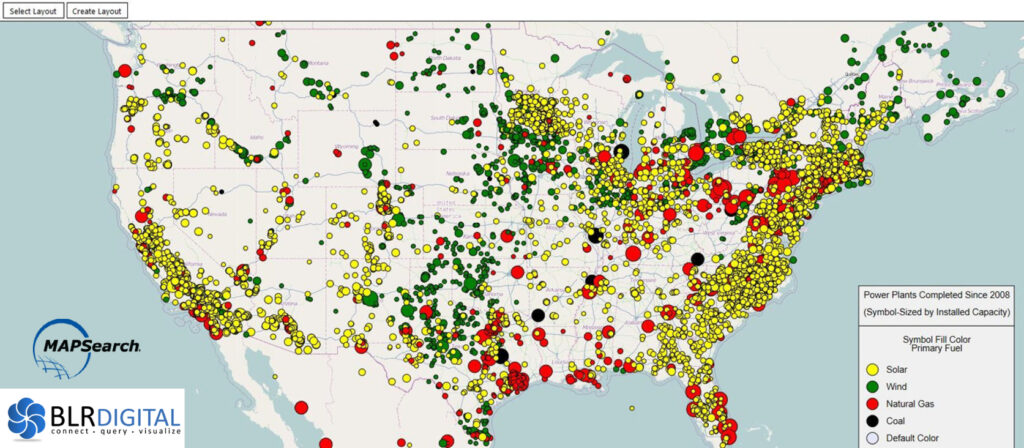
Map visualization illustrates the number of new solar plants completed since 2008 far exceeds other power-gen fuel types, while generation capacity of individual fossil fuel plants dwarfs solar.
Comparing Solar and Wind to Natural Gas and Coal:
Number of New Plants Constructed vs. Amount of New Generation Capacity:
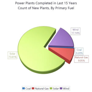
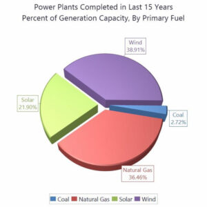
When considering our four Primary Fuels in the study, data shows nearly 3 out of 4 new plants constructed are Solar facilities, while representing 21% of total new generation capacity.
Conversely, Natural Gas fired facilities account for only 9% of new plants constructed yet contribute over one-third of the new capacity. Wind power leads in total new install capacity, supplying 39% of new capacity.
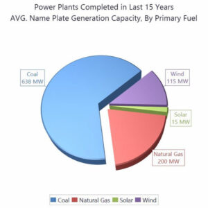
As previously stated, Capacity numbers refer to installed name plate generation capacity and do not, necessarily, equate to actual generation at a given facility at a given time, which is impacted by a number of factors.
Historical Look – What Did Our Power Generation Landscape Look Like 15 Years Ago?
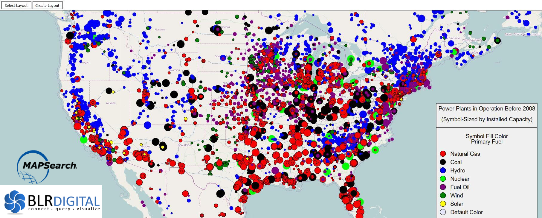
Map displays electric generation landscape, by Primary Fuel & Gen Capacity, as existed in 2007.
And That Same Landscape, Today
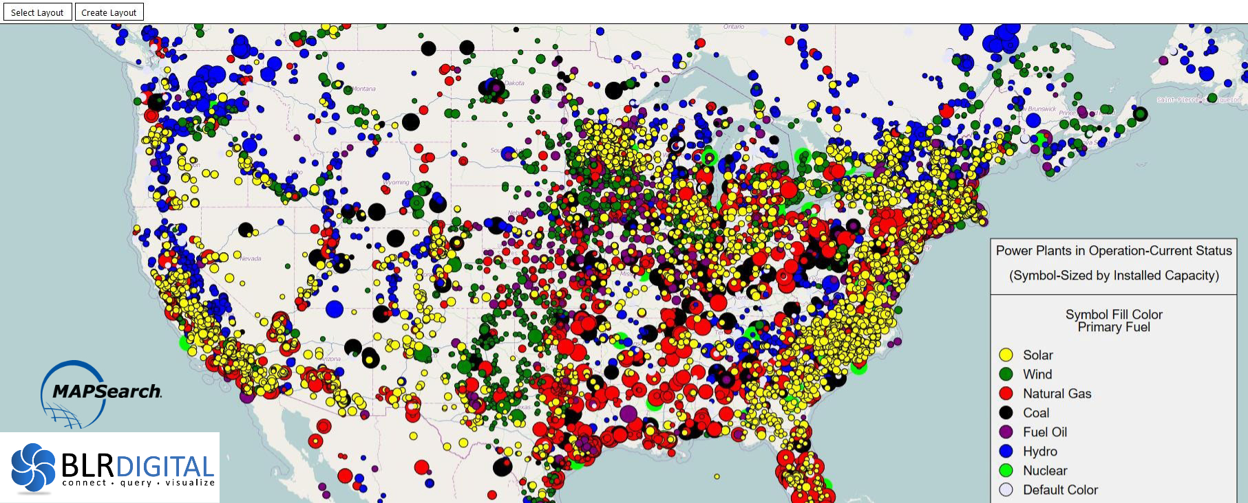
A significant change in 15 years – in Primary Fuel – is established, and the trend to more renewable facilities generating smaller individual base loads. To label an “Energy Transition” requires a longer timeline, more data points, and further analysis. MAPSearch will continue to track our critical energy infrastructure and help our clients and industry make better decisions through informed insight.
Visualizations and images presented are powered by BLR Digital technology, www.blrdigital.com

Ted Mirenda heads sales & product for Endeavor Business Media’s MAPSearch division and has been providing mission critical data solutions to the Energy Industry for 35 years.


